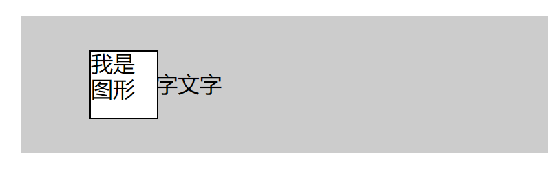
问题场景
实现图形和文字与背景框垂直居中对齐,且图形与背景框左侧水平居中对齐,效果不受图形宽度影响。
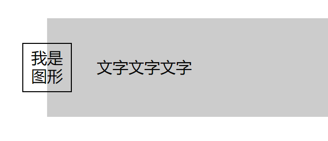
解决方案
使用flex布局调整图形和文字与背景框垂直居中,之后使用定位水平调整图形位置。
1 | <div class="main"> |
1 | /* 背景框 */ |
相关知识
1.设置了绝对定位的元素脱离文档流,显示效果为浮在其他元素上方。
2.flex布局对于设置了定位的元素仍然生效。
2
3
4
5
6
7
8
9
10
11
...
display: flex;
justify-content: center; /* 同时影响文内部文字部分和定位的图片 */
position: relative;
}
.pic{
...
background-color: #fff;
position: absolute;
}
2
3
4
5
6
...
display: flex;
align-items: center; /* 同时影响文内部文字部分和定位的图片 */
position: relative;
}